Changes in Global Earthquake Rates After a Major Earthquake
Changes in Global Earthquake Rates After a Major Earthquake
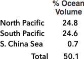
Adjustments to OSU’s Graph†
❧ Main, final section describing how last two data points actually affirm the overall pattern
is being revised more succinctly and direct; hopefully complete by mid August. ☙
This page describes how and why this site’s “Changes in..Quake Rates..” graph* was adapted from the complex graph Nature published (the lower, multi-colored one) – made simpler primarily to be more accessible to a general audience.
* To view what’s behind it, click its
“show/ hide” button at top left corner
It also provides additional confirmation how seismic waves are somehow majorly confined within an astoundingly thin shell.
An additional question arises due to the lack of explanation why OSU only examined small, discrete subsets of the earthquake database. ‐ Their extensive descriptions of methodology do suggest this limitation may not have affected the overall results in a significant way.‐ One can imagine practical reasons, especially possible limitations on the amounts of computer time necessary to query and analyze that vast database (perhaps not least: cost of access). Plus to examine and analyze the entire database would have required a different and likely more complex mathematical approach (also likely needing much more computing and especially development time).
This site hopes and trusts this, and especially the issues below will all be adequately addressed as humanity strives toward full comprehension of these epic results.

from the Figure 4 page* of the report (also linked on this site’s home page); displayed per CC license
* opens the separate graph page Nature published.
(The graph also appears after about the first third of the report: search for “vary.”)
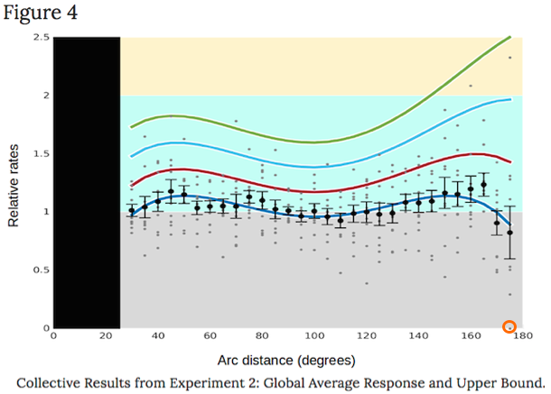
There are no data before 30º because aftershocks were excluded, not in question.
To begin with, the graph was simplified by removing the four wavy lines in different colors (depicting statistically likely trends if the investigation were repeated multiple times).
Then the figures resembling the cross-section of a railroad tie were removed:
 is a statistical error bar
 , representing the range of likely outcomes
if that particular sampling were repeated multiple times.
* Link is a YouTube video explanation. Wikipedia has a succinct description.
Plus the vertical scale was stretched a bit to better reveal the trends.
The graph was then adjusted in three significant ways:
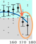
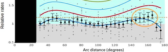
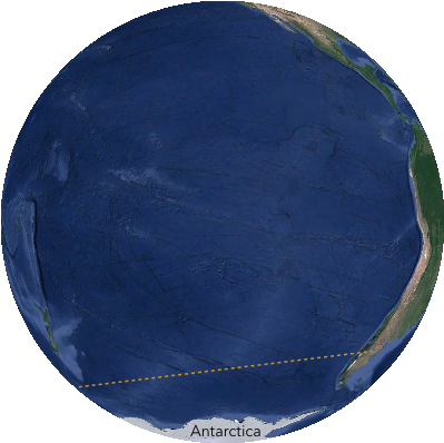
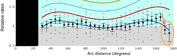
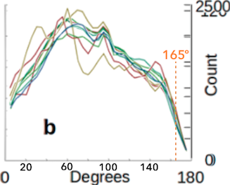
Firstly: The last two data points at 170º and 175º, circled in this image.. →
rather blatantly far out of sync with the others, were removed because they
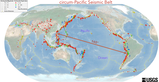
are most likely if not undoubtedly exceptions, due to what seismologists refer to as the Circum-Pacific Seismic Belt along most shores of the Pacific Ocean, where the great majority of large earthquakes the study focused on occur: Virtually every location on the C-P Seismic Belt is within 165º of the rest, hence these furthest two data points represent very different conditions with very different earthquake risks than all other data points on the graph.
Since this issue has a number of rather remarkable facets plus complexities, it is examined after the two other simpler, plus less significant adjustments:
Those details demonstrate what seems an incongruous exception actually further affirms and confirms the overall picture OSU’s landmark investigation revealed – rather astoundingly so.
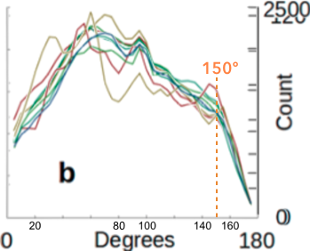
A less obvious adjustment is the furthest two mean rates at 150 and 160º:

were apportioned a bit higher values to compensate for a geometric issue in the study’s protocol that almost if not certainly underestimated rates at those two angular distances:
To compare earthquake locations with each other, the OSU team divided Earth into segments as if a cosmic-sized bread slicer cut the planet into slices 10º thick, starting at epicenters (0º), as illustrated on this detail page.
Each such 10º slice is called a “bin” in OSU’s report.
Earthquakes within each bin were grouped together in calculations: Those results were then placed on the report’s graphs as if all quakes within that 10º bin occurred at its center point.
Although OSU employed several statistical methods to adjust the numerous sets of results in different bins to be more comparable with each other, to this site’s abilities in math and reasoning, it appears those methods may not have fully, if at all compensated for the considerable differences in bin sizes:
Their surface areas vary greatly, by more than an order of magnitude between largest and smallest: from somewhat over a million to more than seventeen million square miles, the largest more than eleven times greater than the smallest. (see detail page for calculations)
Plus the Nature report makes no mention of surface areas, nor did any calculations include surface area.
In comparing samples, it is best to have comparable samplings.
Lacking access to the earthquake database(s), this site applied a relatively elementary approach to adjust the published rates to compensate for differences in bin sizes.
Only the two smallest, but also most crucial bins seem to need significant adjusting. This site’s graph of rates thus displays somewhat higher rates at 150 and 160º than OSU calculated, indicating the same trend but with somewhat greater rates of triggering as seismic waves contract in their final dash to the antipode:
All these calculations and adjustments are on the detail page also linked above.
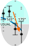
Since this more geometric adjustment is much simpler than OSU’s highly sophisticated protocol and calculations, the background rate of 1 in OSU’s graph was replaced with the label “USUAL” to acknowledge less certainty of the precise rates in those two furthest bins.
It is our fervent hope this issue receives expert attention.
Thirdly, the study grouped earthquakes into overlapping bins that thus somewhat obscured the contrasts between adjacent bins not overlapping, thus tending to also obscure the graph’s several distinct and highly significant patterns. Most all such in-between bins were ignored in generating this site’s graph (not least because most were virtually the same as those included).
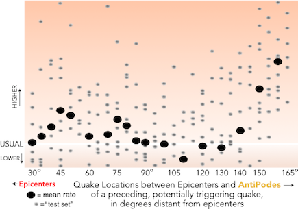
These similarities are visible by comparing the vertical ranges of adjacent gray “test sets,” ¹ as in these two examples, each with an adjacent bin lacking a black oval (the mean* value of each bin):
* average


Furthermore, this site discusses all the areas where adjacent values differ significantly.
¹ Each test set represents earthquakes of the same magnitude (± 0.1, or similar). In the authors’ graph, there are ten gray dots aligned vertically every 5º to represent results at that distance from epicenters for each of the ten sets. The magnitudes included ranged between 5 and 6.5.
Perhaps the investigation was limited to these subsets of the massive global earthquake database, primarily to limit the scale of effort required to query it, plus analyze the results. (Also: To keep the graph’s size more manageable, this site’s version excludes test sets with lowest and highest values. Plus: Only the most distant test sets were shifted somewhat upward, in proportion to adjustments of the two furthest mean values.)
As mentioned, the first and most significant adaptation was excluding the last two data points on OSU’s graph of rates for simplicity.
highlighting these data points
But as the rest of this page demonstrates, this seeming contradiction to the thesis of seismic waves shrinking to focus maximally at antipodes is actually further and rather extraordinary evidence, in trite terms: the exception that proves the rule.
This maximal, abrupt reversal of trend is primarily due to the exceedingly focused, thoroughly non-random distribution of especially major earthquakes around Earth:
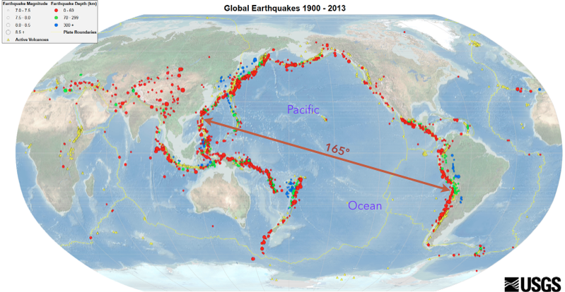
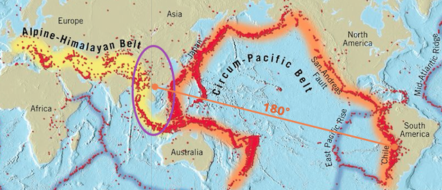
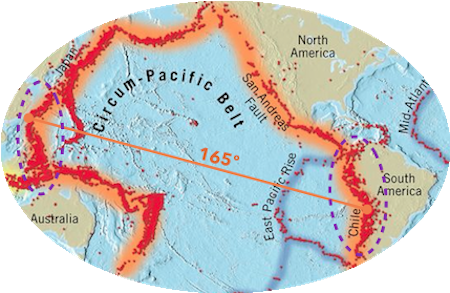
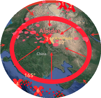
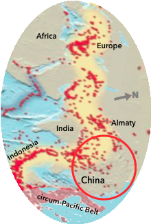
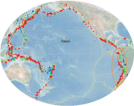
A large majority, more than 80% of Earth’s most intense quakes, hence also the large majority of the many thousands the OSU team selected to study occurred on the same side of Earth, virtually entirely within 165º of each other: All along the planetary feature very well known to seismologists, what they call the Circum-Pacific Seismic Belt* encircling most of the Pacific Ocean – as indicated on this map by colored dots marking Earth’s most violent quakes since 1900:
* popularly known as the Ring of Fire
source; has full scale version
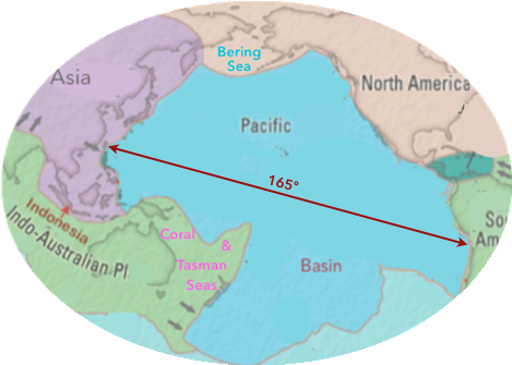
At most, only a tiny percentage of this Belt is wider than 165º,* by a few degrees at most.
* best ascertained with a physical globe (or sophisticated software)
There thus seems little if any doubt this earthquake belt is also evident in the maximally abrupt drop of triggered earthquake rates OSU measured: from the peak rate at 165º to the next, the final two data points at 170 and 175º, by far the most extreme contrast between adjacent data points on the entire graph. click to same graph image as above
But these two most distant rates are actually much more distinctive than just being outside, beyond the quake belt: Such strong earthquakes so maximally far apart, including exactly opposite, antipodal to each other, occur on only a very small percentage of Earth’s surface..
But most significantly: Although quakes in such pairs of nearly and exactly antipodal quakes cannot both be located on the less wide circum-Pacific earthquake belt, they are closely associated with, in planetary terms are just outside, are close neighbors bordering the circum-Pacific Belt:
Such pairs of quakes essentially exclusively involve the region where Earth’s two primary earthquake belts are adjacent:
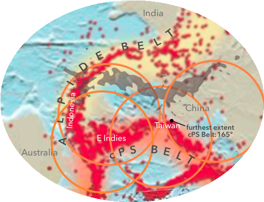
The other, the Alpide Belt in the below map, arcs westward from their intersection in the East Indies – marked below by the white “ I ” * inside the small orange circle at the lower left – then ranges in parallel with the circum-Pacific Belt through Southeast Asia, then China, as illustrated:
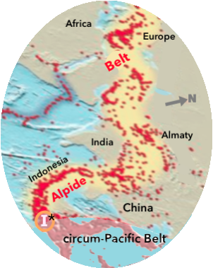
* boundary is undefined: these two belts
have quite a pile-up at their T intersection:
upside-down T evident in next map below
As highlighted below by the violet oval on the global map of both quake belts, the above region from the East Indies through China is the sole location where antipodes of one belt’s quakes are located within 15º of the other belt, as illustrated in detail further below:
Hence: The two rates at 170 and 175º in the graph, representing rates between 165º and 180º distant from epicenters, are solely* indicating rates of subsequent quakes occurring in this portion of the Alpide Belt.
* click for precise minutiae
Strictly speaking, Alpide Belt quakes are also most likely triggering quakes in South America, but since circum-Pacific Belt quakes occur more than ten times as often as Alpide Belt quakes, the rate graph is predominantly, essentially entirely reflecting triggering in Asia.
Detail maps below reveal the regular, violent disruptions all along the circum-Pacific Belt – both below the surface, plus breaching the surface via volcanos – result from a constant battle and scufflings all along the boundary between the two, huge portions the Belt divides Earth into: the Pacific Basin ever jostling with the rest of Earth surrounding it:
90% of all Earth’s quakes occurring along this battlefront between these two very different parts of Earth demonstrates how intensely these two portions the Belt divides Earth into ever strain and wrestle, to some extent rub against each other, ever spar along this remarkably narrow boundary, continually battling for advantage humanity has yet to ascertain clearly . .
Including, as mentioned, volcanic eruptions: in fact the greatest concentration of such fire mountains on Earth, hence the other, much more popular name for this ever-tumultuous Belt is the Ring of Fire.
– While geologists pursue all sorts of ideas and theories attempting to identify the primary dynamics and / or other factors driving these so horrifically violent events, this site just explores the ways the available evidence demonstrates Earth has an astoundingly thin outer shell, somehow confining a significant if not great majority of seismic wave energy within it. –
In brief: The collapse in earthquake rates OSU discovered beyond the circum-Pacific Belt’s 165º occurs because – regardless whatever is driving them – locked, pent-up forces along these relatively nearby Alpide faults are diminished as quakes along the circum-Pacific Belt partly release, hence diminish whatever stresses and/or strains are causing quakes in this region where these two belts parallel each other.
Quakes occurring greater than ten times more frequently on the c-P Seismic Belt than along the Alpide Belt also demonstrate the far greater susceptibility of the cPS Belt to earthquakes, and undoubtedly to triggering as well.
Decreased stresses in the parallel, far less quake-prone Alpide region faults by nearby cPS Belt quakes are thus made evident in the steeply diminished Alpide quake rates following a quake on the opposite side of Earth, to far below all other rates OSU observed:
Actually for several days, rates of quakes on the neighboring Alpide Belt collapse far below usual, illustrated by the seemingly contradictory, maximal collapse after 165º on OSU’s graph of rates:
Rather than a contradiction, then, this seeming reversal of trend is instead an additional confirmation fully consistent with this site’s thesis regarding seismic wave trajectories.
The remainder of this page reveals what we authors consider rather extraordinary and wondrous details, as well as the several calculations and detailed observations further demonstrating and supporting these conclusions.
Also, it may well be such shifts do not always manifest as detectable earthquakes along the Belt, nor on neighboring faults.
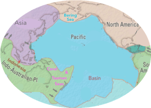
The cPS Belt occurs along a precipitous undersea border, by far our planet’s most extreme shifts in elevation, into by far Earth’s largest and deepest ocean basin: The entire Pacific Ocean contains half of all Earth’s sea water – more than twice as much as the entire Atlantic Ocean, with more than 90% of that in its much deeper basin (illustrated below).
Nearly all walls along the Basin’s perimeter rise almost vertically to the continents and shallower seas surrounding it, where most of the shorelines are among the planet’s most dramatic: many, if not most are cliffs at the base of steep mountain slopes.
But the Basin’s submerged borders are far more dramatic, as indicated in these two images:
Far East coastlines South American
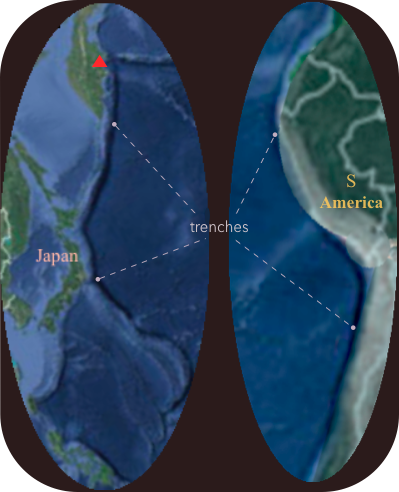
The very thin, very dark blue trenches abutting continental shelves are where Earth’s surface reaches its deepest points, the planet’s only ocean trenches rivaling the record Marianas Trench depth – but actually far surpassing it measured from the tops of countless mountain slopes plunging so dramatically, to maximally steeply as vertical cliffs towering above the coastline.. cliffs whose bases also tend to drop too rapidly toward trench depths for beaches of sand to accumulate, as continental margins plunge all the way to abyssal plains just offshore, or a bit further.
In many places along the shores of the Pacific Basin, if the base of Mt Everest* were at the bottom of the trench, the adjacent mountains would soar up to many thousand feet higher than Everest!
For example, the slopes of Eurasia’s tallest active volcano, on the Kamchatka Peninsula – the red triangle at top left above – drop steeply from its peak almost 16,000 feet above sea level,* then plunge from the coast down to the trench nearly the world’s deepest:
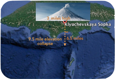
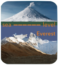
If Everest rose from the bottom of that trench, there would still be over a mile, more than 5,000 feet of water above its peak, as illustrated on the right.
The difference in elevation between this nearly deepest trench on Earth ↓ and the nearby record volcano is right at 50,000 feet, almost ten miles:
*15,580 + 34,400¹ = 49,980 = 9.5 miles
Such extreme, precipitous contrasts in elevation help explain the maximal instabilities along the cPS Belt. As anyone knows who has tried building a sand castle: the steeper the walls the less stable, the easier they collapse.
¹ at end that page’s first paragraph
(Similarly: The near-vertical cliff faces in Yosemite Valley are where rock falls occur most frequently, including large slabs at times.)
In huge contrast: Essentially no if any significant earthquakes occur on the vast majority of the floor of the Pacific Basin – our planet’s largest feature by far, a full quarter of Earth’s entire surface (calculation below) . .
❧ Hence, with an unrivaled monopoly: It’s by far the largest stable portion of the planet’s crust.
Plus, as noted above, far fewer quakes occur on the much larger portion of Earth surrounding the cPS Belt.
The extraordinary, mostly submerged border between the Pacific Basin and the rest of Earth thus exhibits by far the planet’s most extremely contrasting, most abrupt shifts in elevation..
And especially, by far most violently disrupts terra firma – Not just via earthquakes:
It’s also called the Ring of Fire because nearly all of Earth’s volcanos occur along it!
These extreme plus maximally abrupt differences in elevation help explain Earth’s by far worst instability and explosiveness along the cPS Belt / Ring of Fire..
As well as attest to the power of whatever extraordinary processes and dynamics are ever at work maintaining this maximally extreme and stressed configuration along the cPS Belt’s twenty-five thousand miles of mainly coastlines, plus submerged, subsurface cliffs forming its boundary.
Regardless the causes, the OSU results demonstrate a quake along this by far least stable feature on Earth reduces stresses on the much larger portion of Earth surrounding it, hence rates of quakes outside, beyond the Belt drop after a major quake along it, illustrated by the precipitous plunge in quake rates from 165 to 170º on OSU’s graph.
click to of these
data points
Fine Detail: The cPS Belt lacks a southern boundary, is discontinuous across the South Pacific, hence its shape is commonly compared with a horseshoe. more below
The rest of this page examines these unique and wondrous aspects of our planet in more thorough detail, beginning with this higher scale map much better demonstrating the relationship between South American cPS Belt earthquakes and the Alpide Belt:
The light charcoal, insect-like shape stretching across the middle of the map is a projection of those South American quakes onto their antipodes in this unique region,* where Alpide Belt and cPS Belt quakes occur primarily parallel with each other.
* per this antipode map
The orange circles approximately 35º in diameter indicate the portions of the cPS Belt where quakes occur along it between 145 * and 165º from epicenters on its opposite, most distantly separate region along coasts of South America:
* 35 + 145 = 180 = antipode
. . hence, they encircle the Asian region of the cPS Belt where triggered quakes from 145 to 165º on OSU’s rate graph* occurred, the angular distances from cPS Belt epicenters in South America. * with these rates highlighted
This site’s main page features the below example of quakes triggered in this area of Asia by a record quake in Chile:
. . demonstrating how seismic waves contracting in diameter as they rocket toward re-uniting at their antipodes become maximally capable of triggering quakes on the opposite side of Earth from their origin: Increasing thickness of the red curves and ellipses representing seismic waves indicates how a wave’s intensity increases as its forces recombine, hence intensify after stretching to encircle Earth’s entire circumference at halfway on their journey between epicenter and antipode.
As a result, as many as five quakes were triggered along the cPS Belt between 155 and 165º, numbered 4 through 8 above, plus as noted on this detail page, one additional quake in the Philippines near 145º distant.
This illustration also demonstrates how quake rates within 15º of its antipode, where the waves would have been most intense as they contracted ever smaller: rates there were actually suppressed, in this case plummeted to just 1/ 6, just 17% of the rate between 155 and 165º, even though much of that region is part of the Alpide Belt:
Despite seismic waves contracting up to many times smaller in diameter and circumference, hence growing many times more disruptive the closer to the antipode, only one quake was possibly triggered within 15º of the antipode.
This pattern consistently and repeatedly occurred in the half century of earthquakes OSU studied: Here’s yet another button to .
The green circles approximately 30º in diameter in this same illustration as above:
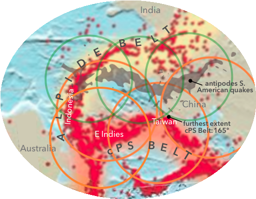
are centered on the South American quake antipodes, hence encircle potentially triggered quakes within about 15º of those antipodes.
The portions of the Alpide Belt within the green circles are indicating the region where OSU found earthquake rates decreased between 165 and 180º.
– Also, for full comprehension, it is important to note the OSU graph displays “Relative” Rates, hence the steep drop in rates from 165 to 170º is not indicating quakes occurred around 30% less often at 170º than at 165, rather the usual rate of quakes at 170º dropped about 10% following quakes 170º distant. Since quakes on the Alpide Belt are less than 10% as frequent as along the cPS Belt, the actual difference in the number of quakes observed at 165 was likely a good 14 times greater than at 170º. –
In Summary: The Alpide Belt abuts the cPS Belt in the East Indies where Alpide quakes occur within 15º of antipodes to cPS Belt quakes in South America. Then from the Indies the Alpides curve through Indonesia, Southeast Asia, and across China while remaining largely within 15º of the South American antipodes.
As noted above, these exceptional parts of the Alpide and cPS Belts are the sole region on Earth where earthquakes commonly occur in two parallel regions within 15º of antipodes, between 165º and maximally far apart = 15º further at 180º distant from quakes on the other side of the planet.
Quakes induced by seismic waves from South America contracting as they near reuniting at their antipodes are strong enough to trigger quakes at this widest extent of the cPS Belt, up to 165º distant in the East Indies.
These triggered quakes then reduce stress along the cPS Belt, and especially help reduce stresses in nearby portions of the Alpide Belt, evident in the plunge far below average quake rates between 165 and 180º.
Additional confirmation of this pattern is rates of quakes are suppressed even lower at the angular distance closer to antipodes (again: the charcoal projection on the map):
Quakes represented by the lowest data point centered on 175º occurred between 170º and 180º from South American epicenters.
The map below has violet circles 10º in radius indicating the primary portions of the Alpide Belt where OSU measured the most suppressed rate of triggering, between 170 and 180º from quakes on the South American cPS Belt:*
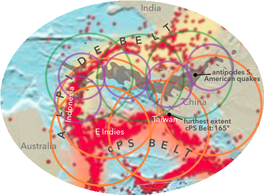
Since the cPS Belt is five to a few more degrees wide in South America, the areas within 10º of antipodes extend a few degrees further into the Alpide Belt than the violet circles encompass.
175º Alpide quakes closer to the South American antipodes are also closer to the cPS Belt than most Alpide quakes centered on 170º (occurring between 165 and 175º distant), hence the latter, 170º quakes are on average 5º further distant from cPS Belt quakes on the opposite side of the antipodes:
The effect of diminished stresses in the Alpide Belt is arguably if not certainly stronger the closer to cPS Belt quakes. Plus the effect of quakes diminishing stresses likely decreases in proportion to surface area rather than linear distance, hence likely diminishes in proportion to the square of the distance.
These angular distance relationships are the sole explanation months of effort found for the seeming contradiction to triggered quakes occurring most commonly near antipodes, increasingly evident from 135 to 165º distant from epicenters.
The remainder of this page includes additional confirming details in OSU’s Nature report, several more exceptional and unique planetary features further confirming this thesis, along with calculations referenced above, ending with summary conclusions . .
All demonstrating this exceptional geographic juxtaposition responsible for the seeming contradiction to seismic waves contracting and strengthening maximally, hence most commonly triggering additional quakes near antipodes.
The below map of what this site refers to as the Pacific Basin reveals it is by far Earth’s largest (as well as deepest) ocean basin, surrounded by the rest of Earth, including much shallower seas between this deepest basin and several of the Pacific’s shores along continental margins:
Click to demonstrating it’s the Pacific Basin’s boundary.
Click here to displaying much shallower Bering, Coral and Tasman Seas,
the main portions of the Pacific Ocean bordering but outside, separated from the Pacific Basin by the cPS Belt / Ring of Fire.
Even excluding the shallower seas bordering it, the surface of the Pacific Basin
is nearly 50% larger than the entire Atlantic Ocean.
(Also: The above map’s projection greatly exaggerates the Antarctic Ocean:
it is just barely one-tenth as large in volume and surface area as the Pacific.
(Furthermore, there is no geographic feature defining a boundary
between the southern Pacific and the Antarctic Ocean, hence there is also
no distinct southern boundary for this site’s concept of the Pacific Basin.)
(click link to hide this image)
Some authorities consider the Pacific extending to the continental shelf of Antarctica.
This image demonstrates there is not a lot of ocean between the undefined boundary
(dashed line) and Antarctica, hence the calculation of Pacific Basin size
below likely includes much if not most of the ocean south of the dashed line.
As the above map of Earth’s geologic regions illustrates, geologists view the Pacific Basin as a unique part of Earth, particularly in comparison to the Atlantic and Arctic: Neither of those oceans are colored blue, are rather considered parts of distinct, massive blocks of Earth with both continental and marine portions.
The Pacific Basin is an exceptional part of Earth, one of a kind.
The Basin is largely surrounded by Earth’s two major landmasses: the supercontinent Africa-EurAsia, the other is the Americas – labelled North and South, of course.
* needs calculation of the Atlantic
Since such flat, planar maps greatly distort the sphere Earth is, it is important to keep in mind images of the Basin better representing its actual roundedness, most helpfully and accurately provided by a physical globe.
This thumbnail of what a satellite can see:
source page has related satellite images of Earth
..hints how the Pacific Basin’s more spherical shape is much better revealed
by a large image from space,* viewable by
clicking to .
*Even this maximally encompassing view from a million miles away
can only capture it in part, but it shows a majority of the Basin, around two thirds or so.
That impressive satellite image greatly helps one grasp the Pacific Ocean is larger than all Earth’s land areas in total, about 10% larger! – That’s including its seas bordering, outside the Basin.
Hence: The Pacific Basin itself covers virtually the same portion of Earth’s surface as all land areas combined.
71% of Earth covered by ocean leaves at most 30% land,
virtually the same percentage as the Pacific Basin:
Calculation of Pacific Basin Size: the translucent, rose-colored portions excised from, then shifted
onto the rest of the world map below
Around 70% of Earth’s surface is outside the Basin, mostly on the opposite side of Earth:
Basin is ~ 30% = ~ 0.85† × 0.5 ¹ × .71²
† Bering, Coral, Tasman Seas, + are outside it
¹ Pacific % of world ocean (above)
² world ocean’s % of Earth’s surface
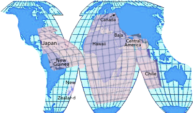
Asian Pacific is superimposed on Western Hemisphere,
central and Eastern Pacific on Afro-Eurasia.

Again: Only a small portion of the Basin stretches to 165º at its widest, a crucial key to what OSU discovered.
Also again: Compared to other ocean basins, the borders of the cPS Belt plunge maximally sharply from its continental coastlines, as well as from the bottoms of its neighboring shallow seas, down exceptionally steep walls including near-vertical cliffs, dropping not only furthest into Earth’s deepest ocean basin, but also into the very maximal number of the planet’s deepest ocean trenches at the bottoms of these steepest walls, greatly towering much higher than any canyon wall or mountainside on dry lands.
– Geologists devote much effort to exploring reasons for these extreme contrasts in elevation all along the cPS Belt, in many locations made maximally extreme by high, typically volcanic mountain ranges near, if not rising steeply up from coastlines.
– As stated on the home page, this site takes no position on what dynamics and forces may be driving these extreme contrasts and violent instabilities, so maximally intense along this “Ring of Fire:” named for the predominance of Earth’s volcanoes along it. –
Regardless the cause(s), the cPS Belt is the most violently unstable part of the planet: where 90% of ALL quakes occur, demonstrating constant jostling between these two very different, highly distinct regions of the planet: the Pacific Basin vs. the 70% of Earth surrounding it. (click button above for calculation)
Although seismometer networks are far too widely dispersed to detect many, if not most earthquakes, seismologists estimate Earth quakes and trembles somewhere at least a few thousand times every day. As a Californian put it: “Terra firma isn’t.”
The thousands of miles of by far the planet’s highest if not steepest walls and cliffs dividing the Pacific Basin from the rest of the planet surrounding it are undeniably Earth’s least stable feature.
Whatever drives these constant skirmishes and tussles along the cPS Belt . .
Especially the tendency of large quakes to be followed by aftershocks reveals a major quake violently marks a breaking point, then like repeated surges from a gradually failing dam, aftershocks continue draining the massive amounts of pent-up energy: Like a dam preventing floods, rigid, fixed strata had been constraining and resisting massive pressures and forces.
Since significant parts of those constrained, damned-up forces were likely if not certainly locked up in nearby portions of crust outside the Ring, it is reasonable if not axiomatic to assume stresses and forces tending to promote quakes within locales adjoining, especially outside, beyond the Ring, that such stresses would be at least partially reduced by a quake on the maximally vulnerable, maximally stressed and unstable Ring.
Hence the rates OSU compiled demonstrate just such a dramatic reduction: the exceptionally steep collapse of quake rates, by far the largest plus most abrupt drop among all rates observed, plunging from the peak at 165º distant to the second lowest data point at 170º, then considerably further down to the lowest at 175º:
Changes in Global Earthquake Rates
But to properly interpret this maximal plunge, one needs to know what the value “1” represents on the graph of rates, what this site labels as USUAL:
The graph compares rates of quakes observed over 72 hours following a major quake at 0º with the average 72-hour rate of quakes over the previous half century, both samplings sorted into sets determined by angular distances from the major quake’s location.*
The results are therefore labelled as “Relative rates:” the observed rates of quakes within 72 hours following a selected quake, compared to the 72-hour rates over the previous half century, on average, sorted by angular distances from the selected quake’s epicenter.
–You may agree the above description is a mouthful. We welcome and would be delighted to replace it with a better version! –
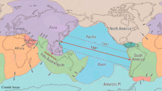
* for those unfamiliar: 180º is the furthest apart any two points on Earth can be.
A rate of 1 at any degree distance thus indicates the two rates were identical, both the rate after an index quake, as well as the average 72-hour rate over the previous half century were the same.
The value “1” thus indicates there was no difference detected in the rate of quakes at any given angular distance from a major quake selected for examination.
It thus seems very likely if a protocol similar to the OSU investigation included identifying where on Earth quakes occurred, the results would affirm this 165º hypothesis.
Such a repetition, however, would be something more like splitting hairs, since it’s virtually certain very close to, if not more than 90% of the quakes OSU studied did occur along the cPS Belt, where 90% of ALL quakes occur.
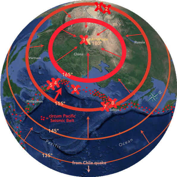
The below image of eight quakes OSU found in Asia,* likely most if not all triggered by a horrific quake in Chile, well illustrates this fundamental planetary dynamic OSU’s graph of rates reveals.
* also examined on this site’s main page, in part
quake locations determined
by measurements on this page
The cPS Belt is the band of small red dots  stretching to almost exactly 165º distant from the Chile quake. (The densest concentrations of red dots are where quakes are most frequent.)
A total of seven quakes,  , were likely if not certainly triggered between 155 and 165º from the Chile quake, including two in central Asia, labelled 1 and 2 at the top of this projection.
Increasing thickness of the two red curves plus two red circles* illustrate how the intensity of a seismic wave increases as it contracts ever smaller in its final rocket dash to more-or-less reunite near, if not exactly at its antipode.
* represented by ovals due to projection
Despite seismic waves collapsing in diameter, hence becoming ever more intense the closer they rocket toward re-uniting near or at their antipode, only one quake was arguably triggered inside the 165º circle, within just a few degrees of the antipode where the re-united waves were most intense.
Furthermore, a large portion of that 15º antipode region is part of the Alpide Belt extending from Indonesia across Asia to Europe, the tiny red, epicenter dots in this graphic:
map from above Alpide Belt link
..the other region of Earth where quakes commonly occur: the lighter red, oval epicenters of varying size in this close-up:
Yet at most only one quake was triggered, #3, where these seismic waves collapsing in circumference would have been multiple times more intense than in the much larger band of waves surrounding this 15º region, the circular band between 155 and 165º where as many as SEVEN quakes were likely triggered.
Although nearly the entire top (western) half of the circular region within 15º of the antipode is part of the Alpide Belt where quakes commonly occur, no other quake occurred even in that exceptionally vulnerable region, where seismic waves would have been most completely re-combined and intense.
The numerous details examined below demonstrate how BOTH patterns in the graph reflect these geographic, cPS Belt realities: both the gradual rise in rates culminating at the 165º peak, as well as the maximally contrasting collapse in rates down off that peak:
This example thus well illustrates the maximally steep, seemingly contradictory drop in rates between 165 and 170º, revealing how Earth’s two maximally contrasting divisions continually interact along the cPS Belt: the Pacific Basin vs. the rest of Earth surrounding it, ever straining against and wrestling with each other, as the next two graphics demonstrate in full:
The shadowy, somewhat insect-like shape across the middle of the below map* represents decades of quake epicenters along the cP Seismic Belt in South America, projected onto their antipodes 180º distant in eastern Asia and the East Indies,† including most of the regions in the above example.
† from same Alpide Belt page linked above
* with the help of tools
like this global map of antipodes
from Wikipedia’s antipode page
Orange circles approximately 35º across demonstrate how these shadowy antipodes of South American quakes along the opposite, eastern edge of the Pacific Basin have a very distinct and significant relationship with the quakes colored red on this side of the Basin: along the circum-Pacific Belt’s furthest western extent in Asia, especially in and nearby the East Indies and Taiwan: Quakes within these orange circles are between 145 and 180º distant from those South American epicenters (as in the first example of triggered quakes above).
The two faint orange circles enclosing Alpide Belt quakes have reduced intensity to indicate quakes are nine times less likely on that Belt than on the cPS Belt.
As the exceptional concentration of red epicenters in both portions of Earth’s two earthquake belts indicate,* quakes are much more frequent in this region of Earth than anywhere else..
– particularly at these angular distances apart, plus especially with this unique setup:
* well illustrated on the Alpide Belt page linked above
One set of these exceptionally frequent quakes are occurring 145 to 165º apart, at the widest extent of the cPS Belt, coincident with the widest extent of the Pacific Basin the Belt encircles. click to illustrating 165º maximum width
Roughly parallel to that group in the cPS Belt is another set of quakes around 15 to 25º further distant, inside faint orange circles also encircling antipodes to the cPS Belt in South America: These are quakes occurring along the Alpide Belt, the next most common location for earthquakes, where about 10% of Earth’s quakes happen, virtually ten times less frequently than quakes on the circum-Pacific Belt.
The above illustration makes visible what the furthest third of the graph of rates reveals:
Quakes triggered by seismic waves from South America on the roughly ten times more susceptible circum-Pacific Seismic Belt, at its extreme width in the East Indies, Taiwan, and somewhat further north.. such triggered quakes reduce stresses on the much larger portion of Earth surrounding the Belt, thereby reducing rates of quakes on the adjacent and nearby portions of the Alpide Belt, within about 15º, as indicated by green circles 30º wide centered on antipodes of the South American quakes:
The antipodal portion of OSU’s Rate Graph, within 30 to 35º of antipodes, certainly by the 150º value on this site’s graph of rates, is primarily, arguably exclusively reflecting rates of quakes related to this unique region where Earth’s two earthquake belts both intersect and are also parallel with each other most closely, for two thousand miles.
A Point, Indeed!
The very sharp turn the cPS Belt makes at Taiwan is structurally a strong stress point among what are otherwise curved borders between Earth’s two primary, greatly contrasting regions – as most any structural engineer would likely agree.
This Google Earth image of the steep walls and deep trenches of the Pacific Basin has a wedge* superimposed as if it cut their very sharp, very acute angle into the much larger portion of Earth surrounding the Basin:
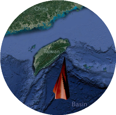
* the orange and black pointed object is a
log-splitting wedge (in case unfamiliar, as we were)
There seems little if any doubt this gash-like feature is Earth’s weakest, most vulnerable feature – hopefully not an Achilles heal!
This close-up further illustrates why the region where Earth’s two earthquake belts meet and embrace most are where our home planet quakes and shudders most, much more frequently than anywhere else on the planet.
A further confirmation of rates in the furthest 15º of the rate graph reflecting the Alpide Belt is the actual numbers of quakes OSU observed at different angular distances, displayed in this composite image of both experiments OSU reported (1 and 2 superimposed):
Since 80% of large quakes and virtually if not fully 90% of all quakes occur within 165º of each other on the cPS Belt, the actual number of quakes during the half century OSU observed, plummets beyond 165º to a small fraction of the rest of the graph, in these greatest angular distances representing quakes outside, beyond that by far most active quake-prone part of Earth.
Furthermore, as the below image demonstrates: The number of quakes counted turns down sharply at 150º due to the size, the surface areas of the sampling bins dropping precipitously in these most crucial distances from epicenters, as demonstrated on the page of calculations also linked above:
All these details demonstrate the pattern near antipodes in OSU’s Rate Graph that appears a contradiction to the thesis of maximal triggering at antipodes is only properly understood as the opposite: The plunge in rates after 165º is in fact a further if not irrefutable confirmation seismic waves behave as if confined in an astoundingly thin shell, hence contract ever smaller in diameter, and most crucially gain in intensity as they converge on their antipode, ever ringing Earth like a bell.
Finally: Just as South American cPS Belt quakes trigger cPS Belt quakes in the western corner of the Pacific, it is most likely if not certain the obverse is true, that western quakes trigger quakes in South America. – Indeed, seismic waves ping-ponging back and forth across the Pacific’s widest stretch increasing rates on both sides is very likely if not certainly a significant reason Earth quakes most frequently in East Asia.
Such ping-ponging also increasing rates in South America is consistent with quake rates being highest along that continent compared to the rest of the Pacific’s eastern side, attested by the density of epicenters there (orange oval):
Note: Many of those South American epicenters are colored blue or bright green,
indicating they occur up to hundreds of miles deeper than the red ones.
It would require a different protocol than Nature published to compare rates of triggering on the two sides of this 165º ping-pong table, but the more extreme configuration, not least the sharp corner of the Pacific Basin at Taiwan, suggests seismic waves from South America are more likely to trigger quakes in this most seismically stressed and vulnerable locale on Earth than vice versa.
Fine Detail: Two other earthquake-prone locations are antipodal to the cPS Belt, near the South Sandwich Islands in the southernmost South Atlantic, plus the region encompassing the Azores and Spain, but quakes are so comparatively few and infrequent there it is unlikely they had a noticeable impact on the rate chart.
Since in these two cases the antipodal regions lack a parallel configuration as occurs uniquely in East Asia, one would posit seismic waves tended to trigger quakes in these small, opposite regions.
It is thus possible the plunge in rates at 170 and 175º would be slightly greater if only Alpide Belt quakes were included.
Terminology point: “Ring” of Fire is a misleading term, not least because, as mentioned above, there’s a huge gap thousands of miles wide across the southern Pacific. It’s also an irregular shape, somewhat like a horseshoe, but a very bent one, especially on flat maps. Both issues are evident on the map above.
This Addendum displays the content of a section hidden above,
especially for readers who did not click to view it. A bit of trivia follows it.
71% of Earth covered by ocean leaves at most 30% land,
virtually the same percentage as the Pacific Basin:
Calculation of Pacific Basin Size: the translucent, rose-colored portions excised from, then shifted
onto the rest of the world map below
Around 70% of Earth’s surface is outside the Basin, mostly on the opposite side of Earth:
Basin is ~ 30% = ~ 0.85† × 0.5 ¹ × .71²
† Bering, Coral, Tasman Seas, + are outside it
¹ Pacific % of world ocean (above)
² world ocean’s % of Earth’s surface
Basin is ~ 30% = ~ 0.85† × .48 ¹ × .71² source
† Bering, Coral, Tasman Seas, + are outside it
¹ Pacific % of world ocean
² world ocean’s % of Earth’s surface
Asian Pacific is superimposed on Western Hemisphere,
central and Eastern Pacific on Afro-Eurasia.
back to Pacific Basin definition ↑
For trivia hounds:
One of the test sets, the lowest one at 175º, has a value of zero, circled in red at the bottom right corner of the Graph of Rates: displayed in full to demonstrate how exceptional this dot is.
The zero value indicates in the range of 170 to 180º from epicenters that test set represents, not even one quake was observed: the relative rate of quakes was nothing.¹
Since OSU also found higher magnitude quakes are more likely to trigger others, it is very likely that test set in the one of two degree distances where quake rates were suppressed represents one of the higher, most likely the highest magnitude test set (subset) of quakes investigated, hence most likely to reduce stresses on the neighboring Alpide Belt, to the greatest extent.
At the other, rather confounding extreme, the test set with the highest rate of triggering also occurred in that bin furthest from epicenters: the tiny gray dot at the top right corner.
(The Nature report, understandably, did not specify which magnitude ranges are represented by each of the three hundred tiny gray dots on the graph. (A few are invisible, presumably obscured by either the oval, black dots indicating mean values, and/or by the numerous statistical trend markings.))
Since all the other test sets in that most distant bin exhibit overall the lowest rate below usual, indicating quake rates were suppressed, that highest test set is clearly a rebellious outlier – or at least missed, if not more likely thought the coach gave opposite instructions.
It’s a good example why humanity has spent so much effort perfecting probability theory: weird to exceptional stuff happens, but only uncommonly.
Hopefully someone with enough skill will calculate the extremely if not vanishingly small odds that both by far the lowest, plus by far the highest rate occurred in the same group of samples!
¹Although the computer undoubtedly performed the calculation, there was no need to compare zero
with the average 3-day rate over half a century: that average could have been any number.