1 Mar 2019
Earthquake Rate Adjustments
to Compensate for Large Differences in Surface Area
among the sets (“bins”) OSU grouped earthquakes into
(Supercomputers were obviously necessary to examine thousands of quakes over decades.)
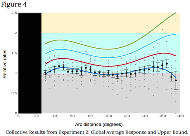
– As noted: Only the last two rates displayed on this site’s graph, at 150 and 160º, seemed to need and were adjusted somewhat higher. –
To locate and compare distances separating earthquakes, the OSU authors sorted quakes into slices of Earth 10 º thick, as if the planet encountered a cosmic-sized egg slicer:

..while skewered through its exact center, like a tomato on a shishkabob skewer:
 (or a caramel apple on a stick)
..with the skewer penetrating from the initial quake’s epicenter,  , through Earth’s center point, thence to the point on Earth most distant from the epicenter, what seismologists call the quake’s antipode:
  , 180 º away on Earth’s opposite side:
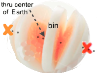
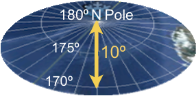
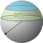
Then, as if Earth were sliced at right angles (perpendicular) to the skewer, the authors referred to each slice 10º thick as a bin – as the below examples illustrate if Earth were sliced while skewered on its axis of rotation (what determines the North and South poles).
The counts of potentially triggered earthquakes were sorted according to which bin each subsequent quake occurred in, following an initial, index quake.
For instance: The below 10 º bin sliced at the far end of the skewer, like slicing the ice cap off Earth’s North Pole, would extend from the cut severing it at 170 º, to Earth’s top point at 180 º, the furthest distant from the South Pole possible.
 (all ice melted)
Each bin is labelled according to how many degrees distant its center is from a preceding, potentially triggering quake, in this case 175º away at the South Pole (on large image below).
The line encircling a bin’s center thus forms a ring all the way around Earth at that same distance from the preceding quake’s epicenter, as does the 175º latitude line in the above North Pole bin (again: 175º distant from the South Pole).
Likewise with the bin centered on the Equator in the second image below, hence labelled 90º: the line encircling its center points is 90º distant from the same epicenter at the South Pole.
(An informed reader will notice these numbers differ from the usual convention
numbering Earth’s poles as 90º distant from the Equator at 0º latitude.)
Viewed from the side of a globe, the above polar slice is hard to see at only 60 miles thick:

That’s less than 1% of Earth’s full thickness: Earth’s diameter just shy of 8,000 miles.
But in huge contrast to its 60-mile height / thickness, this smallest bin, as if sliced off at 170º, stretches almost 1,400 miles wide as it passes just sixty miles beneath the North Pole.
In maximal contrast, the bin at 90º is 690 miles thick, almost twelve times as thick – the yellow band along the Equator in this image:
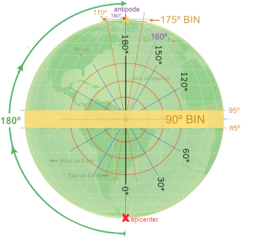
..plus it’s almost 8,000 miles in width: its central plane is the same diameter as Earth.*
*The slight differences among Earth’s diameters
have no significance in delineating the bins.
With such vast differences in the sizes of the bins quakes were grouped into, it’s obvious larger bins are likely to have higher counts of quakes than smaller ones, thus tending to obscure and /or distort any actual patterns of triggering at different distances.
Furthermore, the landmark OSU results reveal surface area is more appropriate than volume for determining bin sizes, especially because seismic waves spread outward and around Earth roughly parallel with and in amazingly close proximity to the surface primarily, as this web site demonstrates in detail.
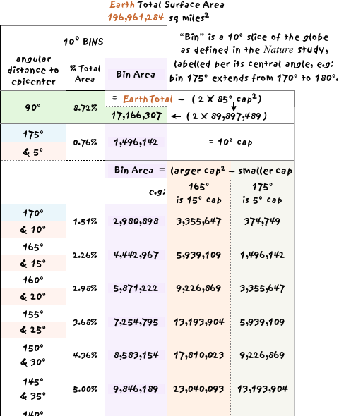
In the above, most extreme example of differing bin surface areas, the surface of the equatorial bin at 90º is almost twelve times larger than the polar, 175º bin ( 8.72 / 0.76 = 11.5 ; details in the spreadsheet below).
To properly compare rates in different bins, it is thus necessary to set the boundaries of bins to be as similar in surface area as possible.
Lacking access to the seismology database(s?) OSU employed, the earthquake rates observed in their very different-sized bins were adjusted to an average bin size in surface area, per calculations listed in the below image of the spreadsheet that performed them.*
* This adjustment procedure is the simplest and arguably the most accurate of several different approaches
explored. If time permits, the entire spreadsheet will be made presentable enough to download.
Table of Adjusted Earthquake Rates
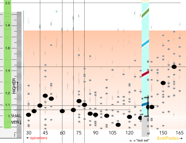
Following below are the jigs used to precisely measure the rates on OSU’s graph (click to show | hide graph)
– to then adjust OSU’s rates for surface area. – Or access the jigs by clicking here. (a link there returns here)
(Further below is a link to the graph page on Nature’s site).
Details how bin surface areas were calculated are at bottom,
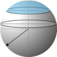
employing “cap” surface areas, the blue area of this diagram:
Since the OSU authors divided Earth into bins at every 5º,
there are over thirty bins, overlapping each of their neighbors by 5º.
Again: Bins are labelled according to the degrees of distance between an initial quake’s epicenter and the latitude-like line at the center of that bin.
8 June – NOTE: The below table is months out of date, reflecting an earlier attempt to adjust quake rates for varying bin sizes.
An updated image displaying the much improved spreadsheet is on the way: It’s a somewhat more complex but also more straightforward approach to adjusting the rates OSU published.
On the other hand: The calculations of bin surface areas needed no adjustments: The surface area values on the right side of this image are correct, hence were also employed in the final version of adjusted OSU rates displayed in this site’s graph.
The below graphic displays the top portion of the spreadsheet employed to calculate bin surface areas, demonstrating the smallest bin centered on 175º ¹ had less than 10% as much surface area as the largest at 90º.
¹Not included due to issues discussed
on the Adjustments page, hence not adjusted below.
² Estimates of Earth’s radius vary by a few hundredths of 1%;
some state 3959 miles is the average radius. The online calculator
linked below returns the above surface area for this radius.
³Extra precision was estimated on this key rate.
Click here to download the Numbers spreadsheet (Mac OS, zip archive). Here is the Excel version, but it has not been tested on a Microsoft machine.
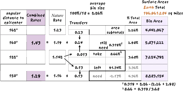
The next image below is the portion of the spreadsheet employed to adjust the furthest two data points on this site’s Graph of Rates, the 150 and 160º rates.
In brief, percentages of adjacent rates were appropriated in proportion to differences in bin sizes, via the simplest way this site was able to imagine or devise compensating for those differences.
The adjusted numbers are called “Combined Rates” because rates from adjacent bins were added to the measured rates OSU reported.
OSU divided Earth’s surface into bins 10º wide, hence ideally each bin would be 5.56% of the total surface. But as the above illustrations demonstrate, to have bins with the same surface area, one would need to adjust angular distances accordingly, hence bin borders would be closest together at 90º and furthest apart at antipodes and epicenters.
(This site has not calculated what the degree distances would be to the centers of bins with identical surface areas.)
A rate of 1 means there was, on average / overall no change in earthquake rates observed in three days (72 hours) following the major quakes investigated – at the bin degree indicated.
A rate greater than 1 therefore means a greater number of quakes was observed in those three days than the average rate recorded over all other three day periods during the half century investigated.
Conversely, a rate less than 1 means fewer quakes were observed during three days after a large quake than usual for half a century.
Only two of the bins displayed on this site’s Rate Graph clearly need significant adjusting.
(The highly contrasting trends in the other sections of OSU’s graph appear to demonstrate the patterns distinctly enough to support this site’s conclusions about Earth’s interior.)
(Also: While it’s now clear it would have been very worthwhile to include some sort of indication in the results how patterns of triggering relate to specific regions of Earth’s two earthquake belts, that would have required a considerably if not massively more complex set of instructions to query the earthquake database(s).)
As the numbers and calculations below demonstrate, for the 160º bin, the 0.23 elevation above average rates in the adjacent 165º bin above it, plus almost 9% of the 155º bin elevation, were both added to the 160º bin rate, resulting in a total rate of 1.43.
The remaining 91% of the 155º rate was then added to the 150º rate: Although it was more than needed, no borrowings were made from 145º, thus effecting something of an in-between rate.
The above method was necessary for this effort. Had we the expertise and resources of the Oregon State University team, we would have repeated their protocol with bins identical in surface area.
It is our fervent hope such an investigation does occur, but also with consideration for where earthquakes occur on the earthquake belts (or otherwise), not least because distribution of quakes along the belts is not random.
Again: Such a protocol would obviously be more complicated than the already extremely sophisticated one OSU employed to obtain the results humanity is now so fortunate to have.
Jig to accurately measure triggered rates on Figure 4 graphic Nature published:*
“Summary plot of additional test sets…”
* opens graph on Nature’s site
The source image was proportionately compressed vertically to aid assessing the precise value of the midpoint of each data oval, thereby flattening each into a lozenge or sausage -like shape.
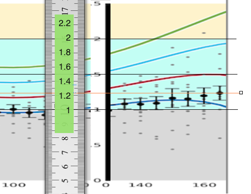
The fine orange line passing through 1.23 on the scale registers the highest value on OSU’s graph, at 165º.
The ruler was shifted along the graph until each data point was measured, also by aligning the orange line as accurately as possible with each data oval.
back to Table of Adjusted Rates
Jig to accurately place data points on this site’s Graph of Adjusted Rates
OSU’s Figure 4 (at the above link) was stretched vertically to better display the full range of rates of triggered quakes at the various angular distances.
Rulers were then placed to provide a scale representing rates of subsequent quakes.
Several of the horizontal and vertical guidelines are still visible that were employed in placing the center of each mean data point  as accurately as the software allowed.
With particularly crucial data points, the ruler was positioned directly on the graph:
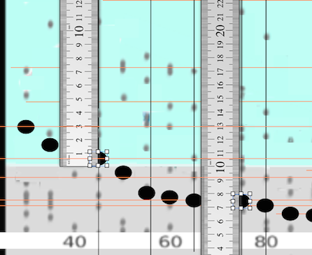
Especially due to the large numbers of small gray dots representing “test sets,” these were not further adjusted after vertically stretching Figure 4, except for the two highest test sets on the far right were, however, shifted upward the same proportion as the mean data points in each of their bins were, to better represent the overall pattern.
back to Table of Adjusted Rates
Source of Cap Surface Area Calculations
The table below displays the result for a cap surface extending 85º from a single point at the sphere’s apex, calculated for Earth’s average radius of 3959 miles. Adding commas gives the number 89,897,488.65 square miles, as entered on the second line of the table, for 90 º.
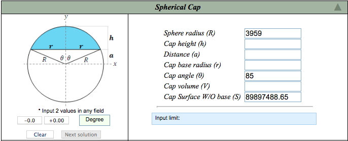
courtesy of Ambrosoft calculator
(Not shown is the same 85º cap area was also used to calculate the sizes of adjacent 10º bins
centered at 100 º and 80 º.
(Those two bins are the same size, mirror images of each other reflected in the plane at 90º.))